
 |
| Down in the valley... |
Of course, I use a bunch of Excel stuff to keep track of everything. However, there's not much random generation going on, just a lot of tables and lookups. But for this week's tool, I'm going to reveal a super-awesome way I've devised to keep track of my hex map within excel.
Hexes in Excel? Yep! You just have to be.... extremely creative... with graphs.
Valley of the Lords: Mapping Tools
The first thing to do is figure out the size of your hex map. If you're like me, and decide to slowly kill yourself with D&D, you can make it several hundred hexes. But even smaller maps are possible with this process.
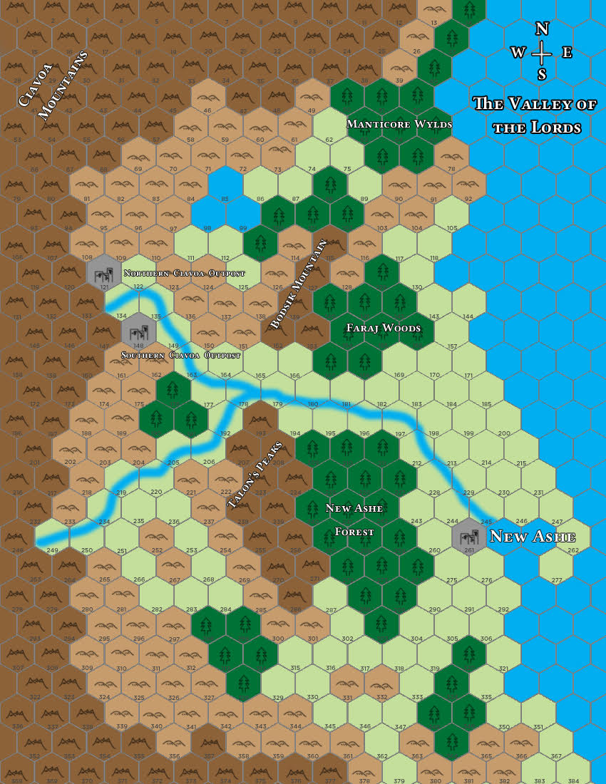
You'll need an image of your hex map with the hex grid already laid out. Unfortunately, that's not something you can do in excel. I recommend Photoshop or another mapping software. I had already created one for the Valley's PDF.
Once you have that, you can insert the picture into excel using either an image formula or by copy-pasting. I prefer the latter for Google Sheets, which is what I'm using here.
Once you have the image in Google Sheets, you'll have to set up your data table for a point graph. As you can see in the image below, you'll need to set up your data correctly to get this to work.
- Column A is simply the number of the hex. We'll reference it a lot.
- Column B is the "value" of the Hex. In this example, it's the status of the hex (Unknown, Discovered, etc). These are designated in a small lookup table by a flag, and change when the flag changes.
- Column C is the flag for the value in column B. I'm pulling these values with a vlookup formula on another page. You'll see why in a bit, but you could also simply type the values in.
- Column D is the X value of the hex. This one won't be seen by the graph, but we set it up to reference later.
- Column E is the Y value of the hex. These will be seen be the graph, and remain constant.
- Columns F-L are the flagged X values. Notice how when the flag is 2, the X2 column displays the numbers. It's a fairly simple IF formula to do this.

Also, here's the lookup table I created for the flags. For reference, we're looking at "Current" and "Status" to reference what data should be used. Notice how Unknown is flagged at "2", making the data above display "2" and "unknown".

Now, the picture of where I'm going with this might be clearer. I have multiple data sets assigned to each hex, just like I outlined in my exploration article. If I want to reference a specific data set, I can select it from a drop-down menu on the map page.

Notice how the options in the drop-down menu match the data sets. When I select one of these options, the flag changes in the data, and a new set of data is referenced for the hexes. I even have a color-coded key:

The colors in the key, of course, match the colors of the data sets in the graph. And here's where it all comes together.
We can create a point graph using the singular Y values, and the 7 different sets of X values. Each set of X values constitutes a different colored data set. If an X value is #N/A, it won't be displayed. Thus, the Unknown, Discovered, Settled, and Conquered hexes will have different data sets, and those data sets will display different colors.
With a bit of finagling, we can line up this point graph with the image of our hex map, change the points into hexagons, and voila:

A map of the entire hex map, with colors indicating the current status of every hex.
Of course, I have 6 other data sets that could also be applied. For example, here's the terrain colors.

All I had to do in order to change the map colors was call on a different category of data, which altered the flags and changed the points that were visible on the graph. Then, my color-coding assigned the correct values to the data.
This was all inspired by this amazing graph put forward by NPR, explained by this PolicyViz article. The PolicyViz article does a good job of explaining in detail how they did this, but I definitely think it's worth sharing and reiterating in the D&D sphere.

So, that's how I'm visualizing all the data on my hex map at once. It's way faster than a lookup table! Obviously, it's not so useful when it comes to checking out a specific hex, but I'll go over that in a future article.
Thanks for reading!
No comments:
Post a Comment